Simran Jobanputra KumarBoston, MA
← All work

Ray · Founding designer

A brand and design system for an AI trainer

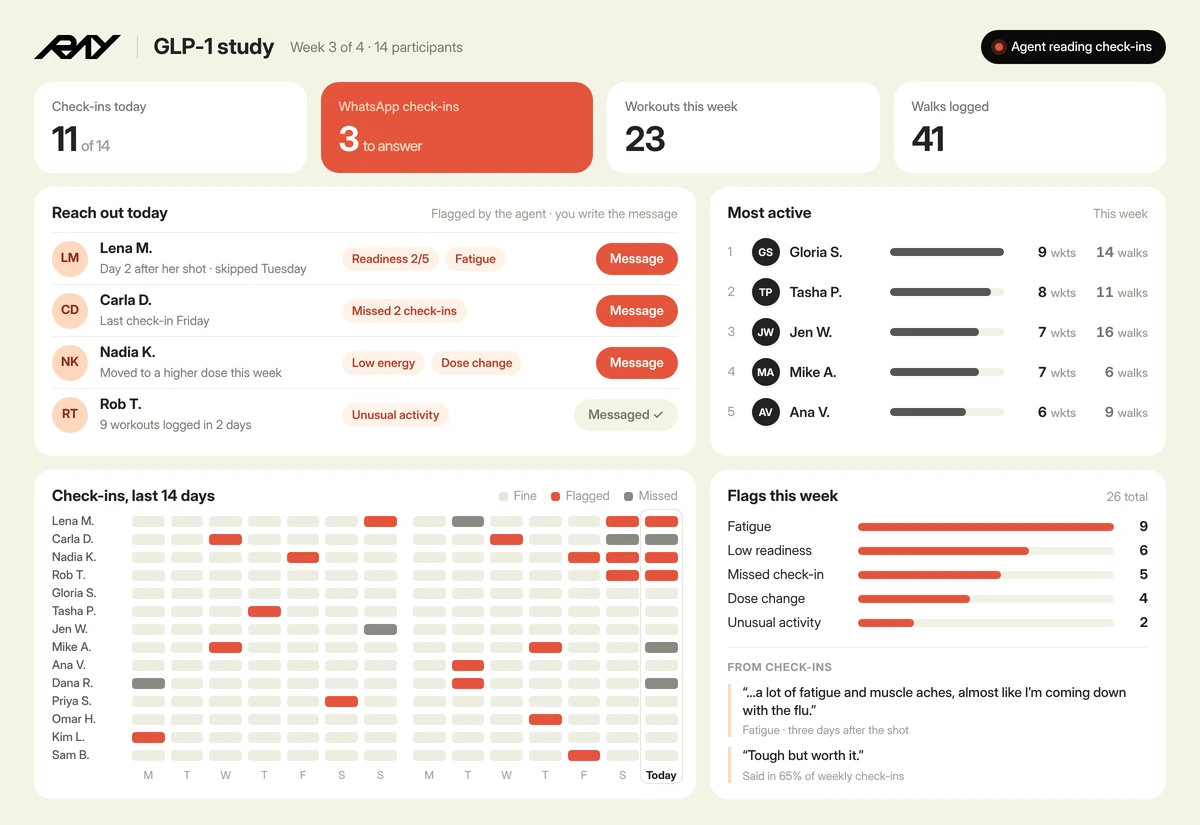
I built Ray’s brand and design system from scratch, enabling my team of 6 to ship quickly.
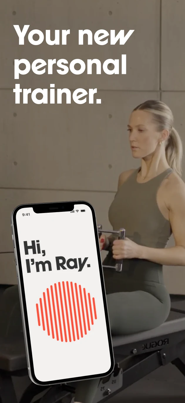
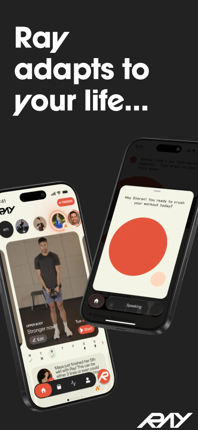
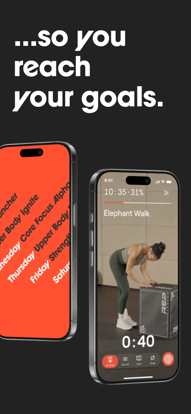
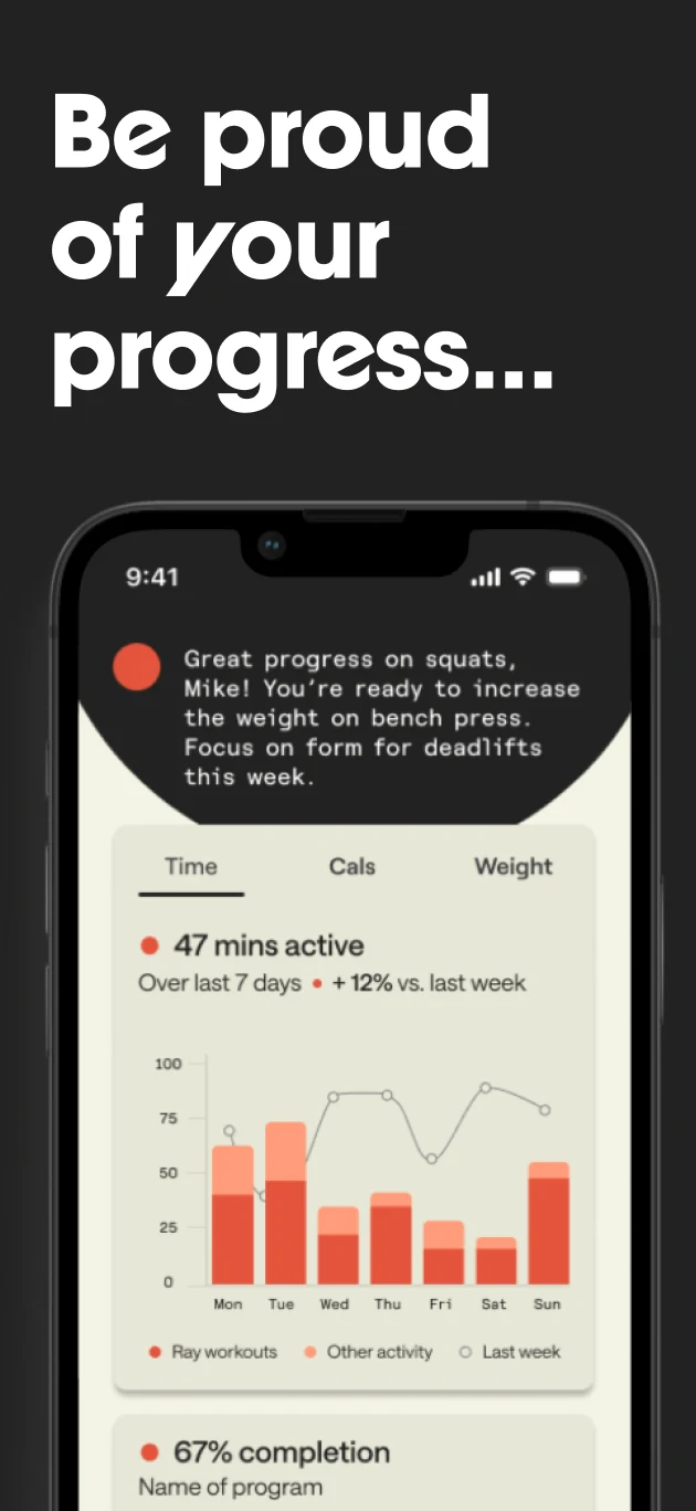
App Store screenshot: Your new personal trainer, with the Hi, I’m Ray screenApp Store screenshot: Ray adapts to your life, with the home screen and Ray’s orbApp Store screenshot: so you reach your goals, with a workout in progressApp Store screenshot: Be proud of your progress, with weekly activity charts
01

Brand
foundations

I designed a cropped logotype, five color themes users can choose from, and type that’s easy to read mid-set.
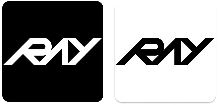
Logotype
The Ray logotype in white on black and in black on cream
Symbol
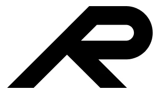
The Ray R symbol
Typography
A sample of the type scale: timer in Roobert Semi-Mono, headers in Roobert, body in Saans
Color themes

Themes on top, the neutrals and cream every theme shares below.

02

One system for
phone and watch

I built the system to work across the iPhone app and Apple Watch, from the home screen to the end of a workout.
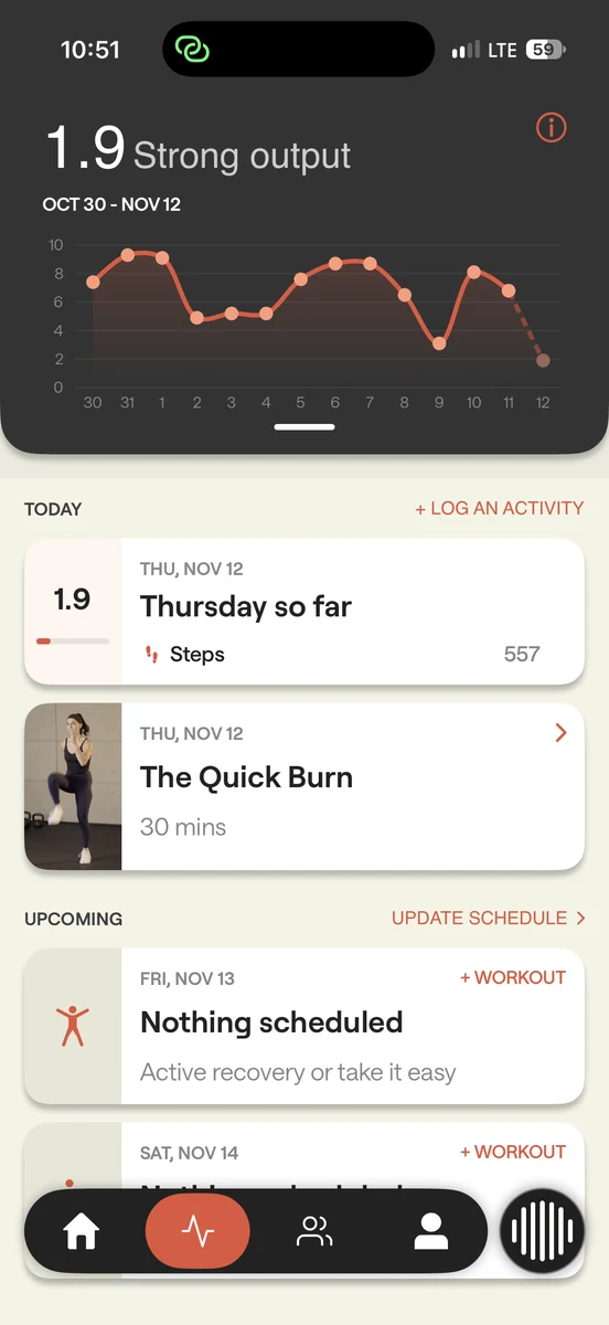
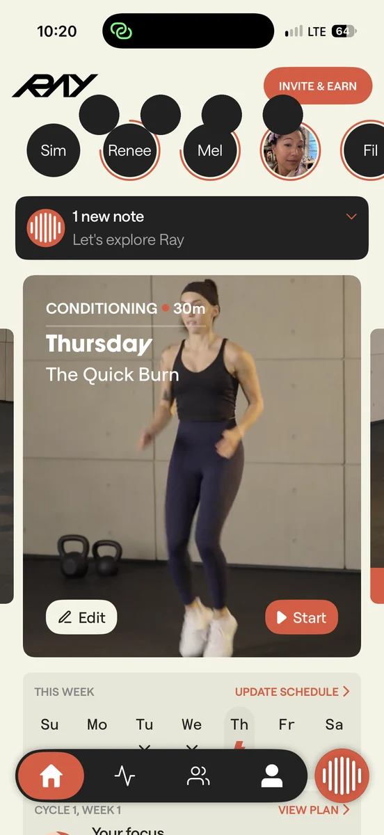
Activity: a 1.9 score with a two-week chart, today so far and what’s coming up
Home: today’s workout, The Quick Burn, with this week’s schedule below
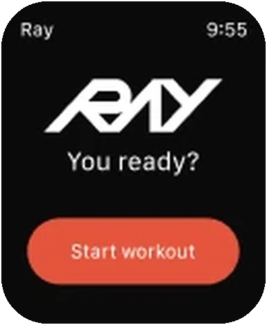
Watch: Ray logotype, You ready?, Start workout
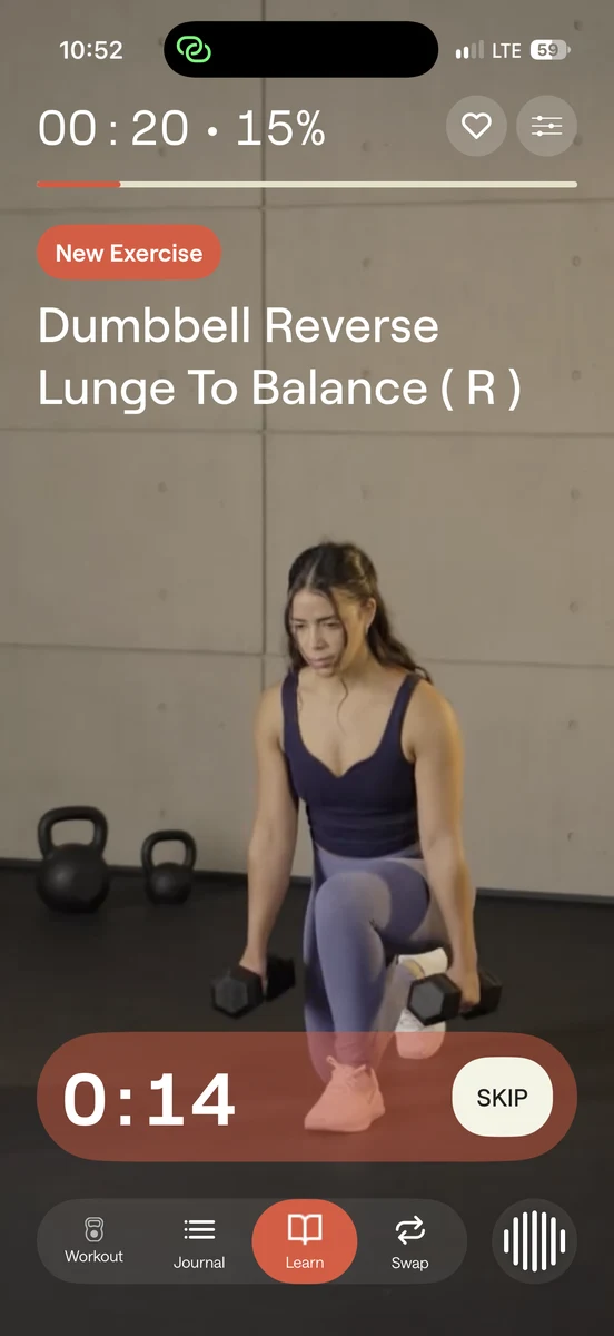
In a workout: dumbbell reverse lunge with a 14 second timer and the workout toolbar
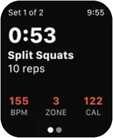
Watch: 0:53, split squats, heart rate, zone and calories
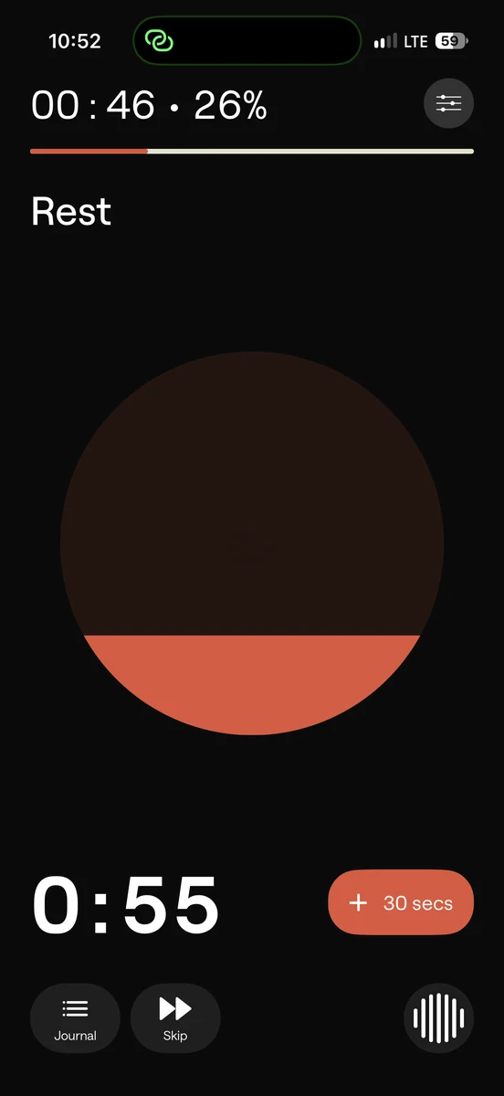
Rest: a 55 second timer with Ray’s orb draining
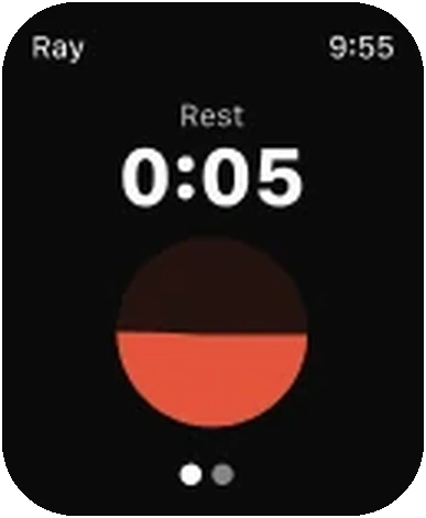
Watch: rest, 0:05, with the same orb
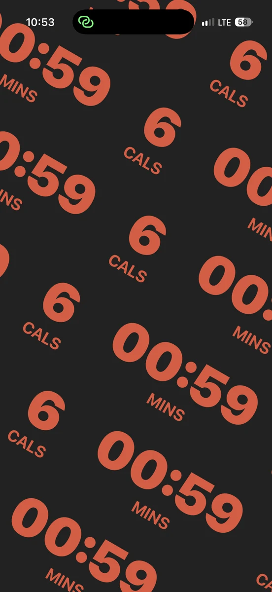
End of workout: minutes and calories repeated as a diagonal pattern
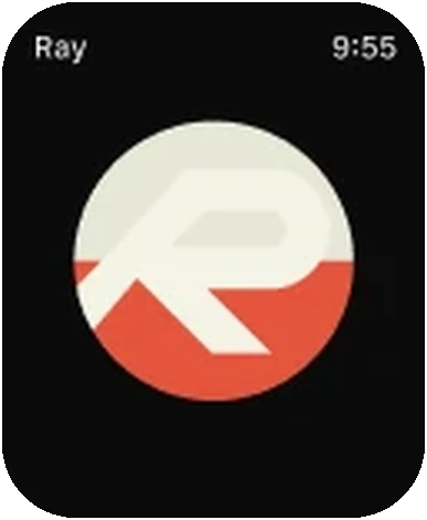
Watch: the R symbol filling with color
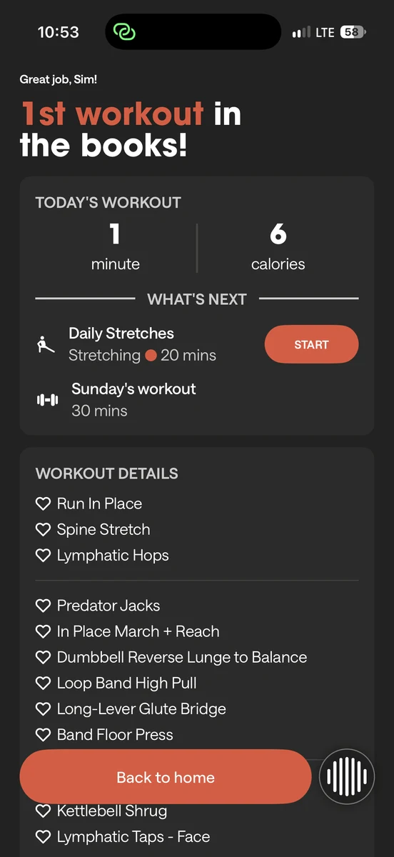
First workout in the books: today’s numbers and what’s next
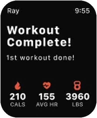
Watch: Workout complete, with calories, heart rate and pounds lifted
03

Motion and
Ray’s voice

We wanted Ray to sound enthusiastic and have a point of view of their own, so we prototyped different voices and tuned each line before it shipped.
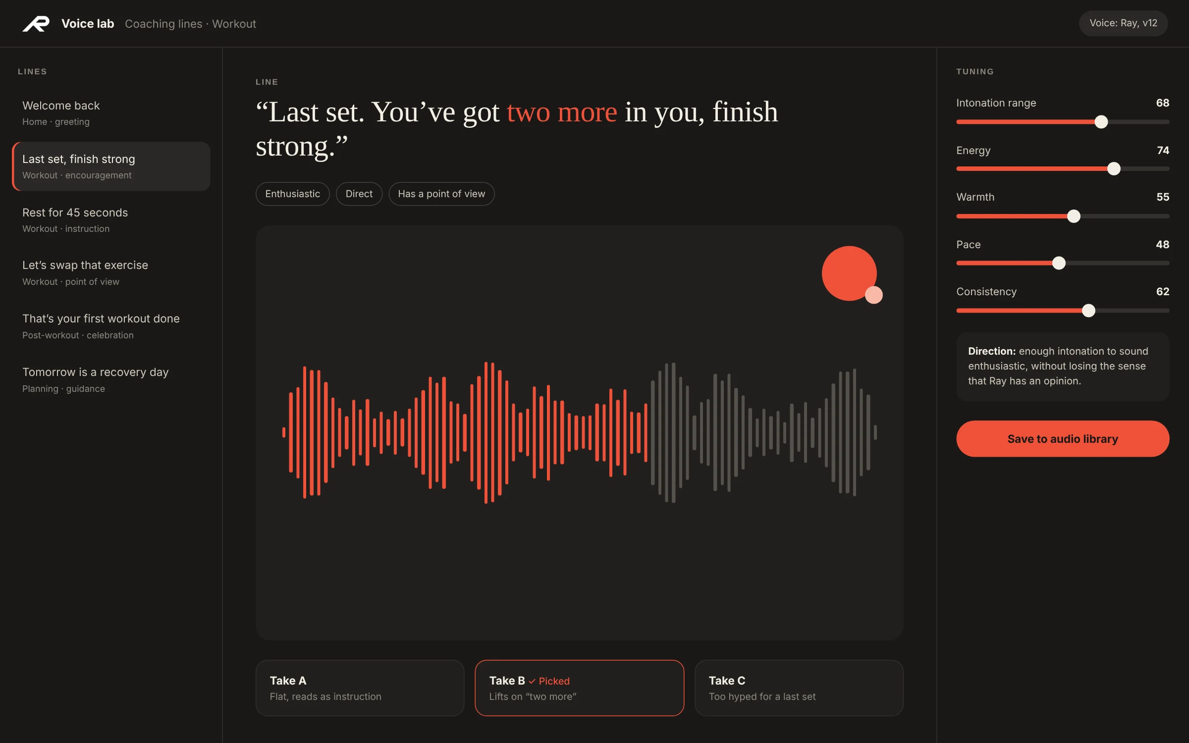
A voice tuning tool in Ray’s style: a list of coaching lines, a waveform with three takes, and sliders for intonation range, energy, warmth, pace and consistency
An illustration of how we tuned Ray’s voice, line by line.
04

Marketing and
social brand

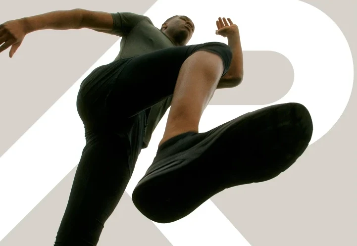
I extended the product palette for marketing and social, working alongside an external branding agency on the guidelines.
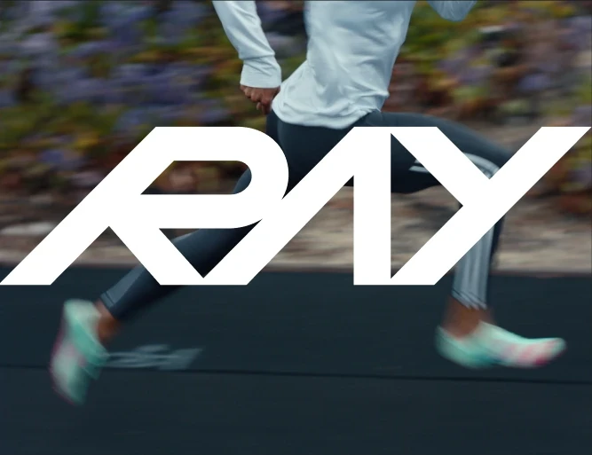
The Ray logotype over a runner
The R symbol behind a jumping athlete
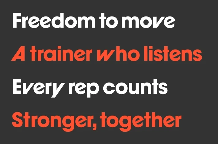
Display type reading Freedom to move, A trainer who listens, Every rep counts, Stronger, together
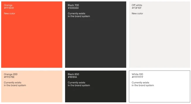
A new orange and off-white alongside the product’s black, orange tint and white
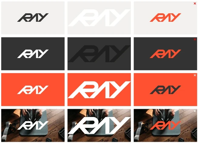
Logotype color use on light, dark, orange and photo backgrounds
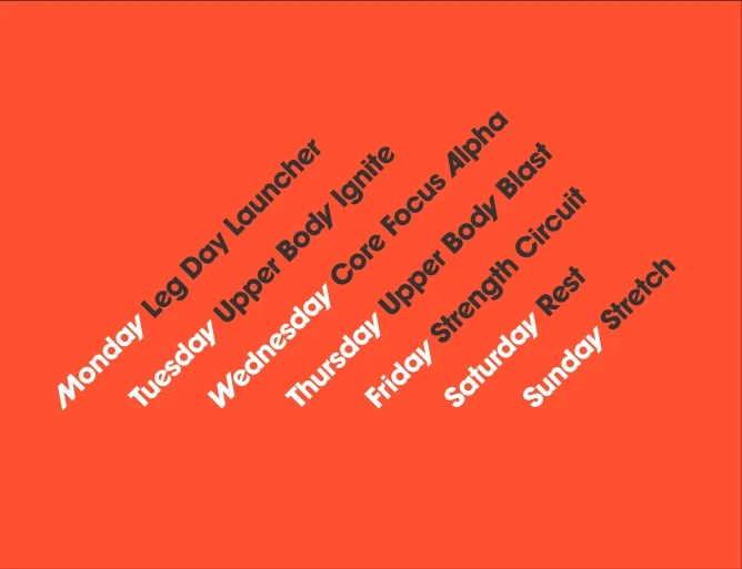
A week of workouts set as type at 45 degrees on orange
05

Working
with AI

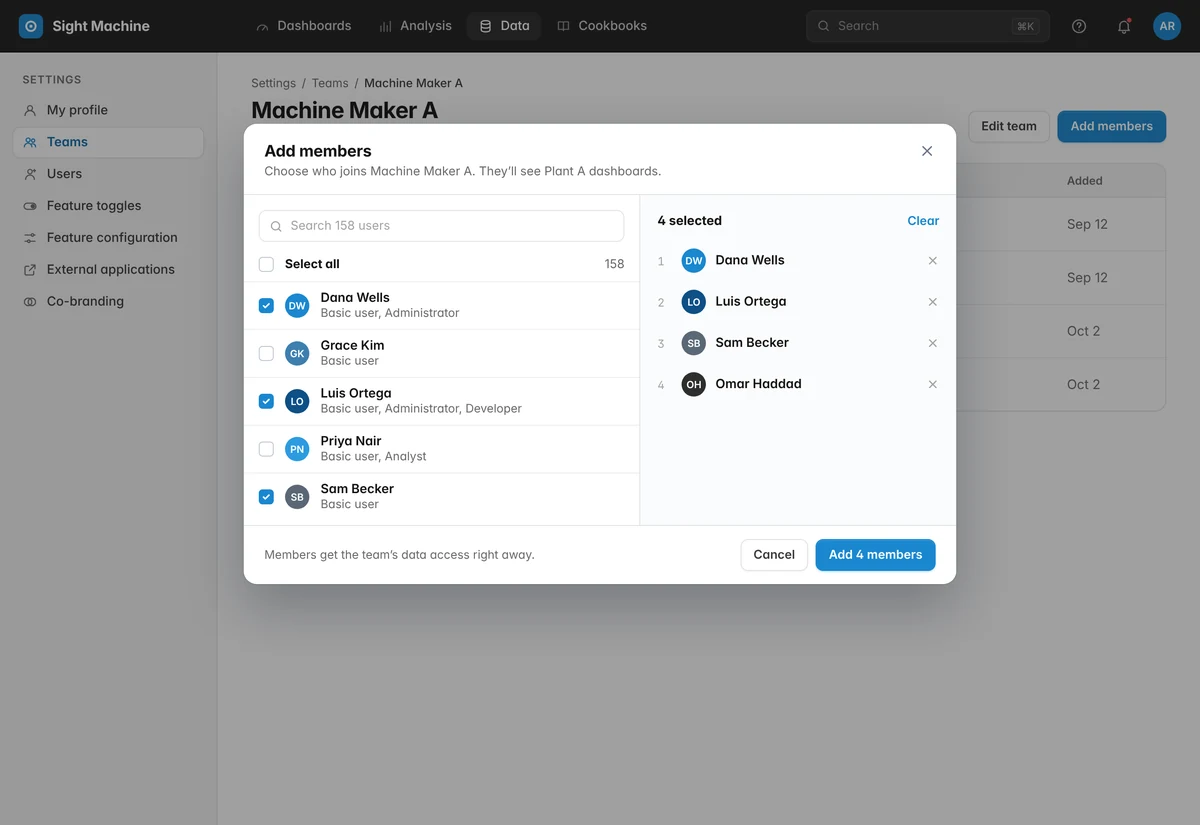
I was beginning to connect the Figma file to the codebase with AI, so components and tokens share one set of names and a change in Figma maps straight to code.

Component

Button

Primary, in each theme

StartSunset
StartCotton Candy
StartIndigo
StartSky
StartYinzer

Secondary and compact

EditSecondary
STARTCompact
Fill
accent/primary → Theme
Label
text/on-accent

More case studies

All work →