1 / 3
What research told us
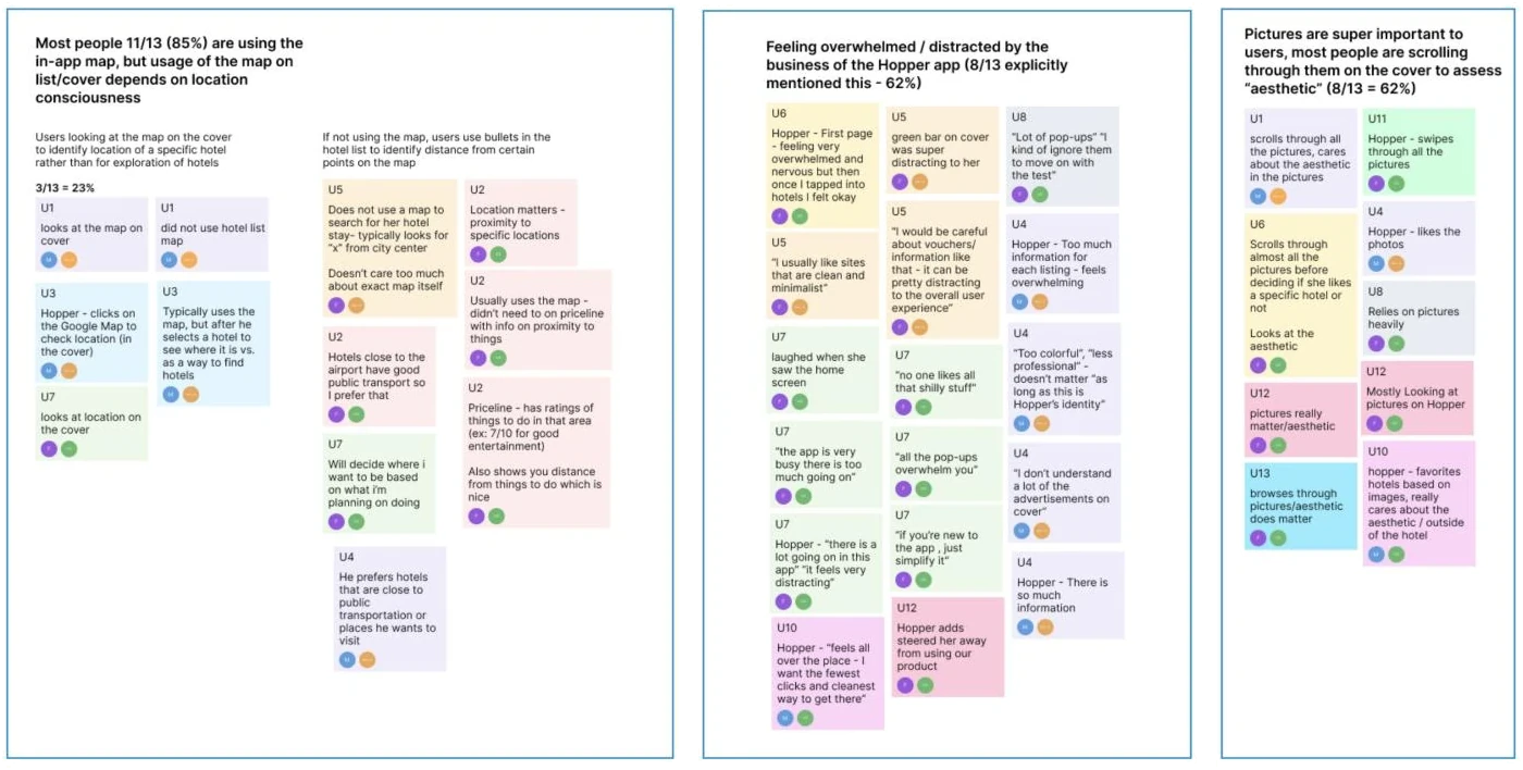
I started with past data and a competitive analysis to form my hypotheses, then validated them in 20+ interviews.
Hopper
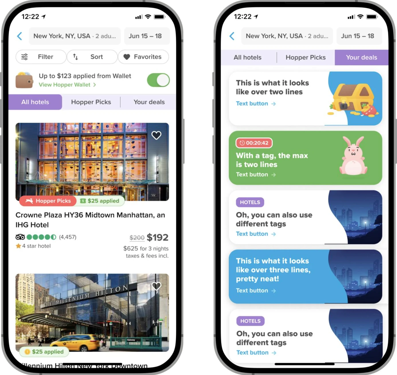
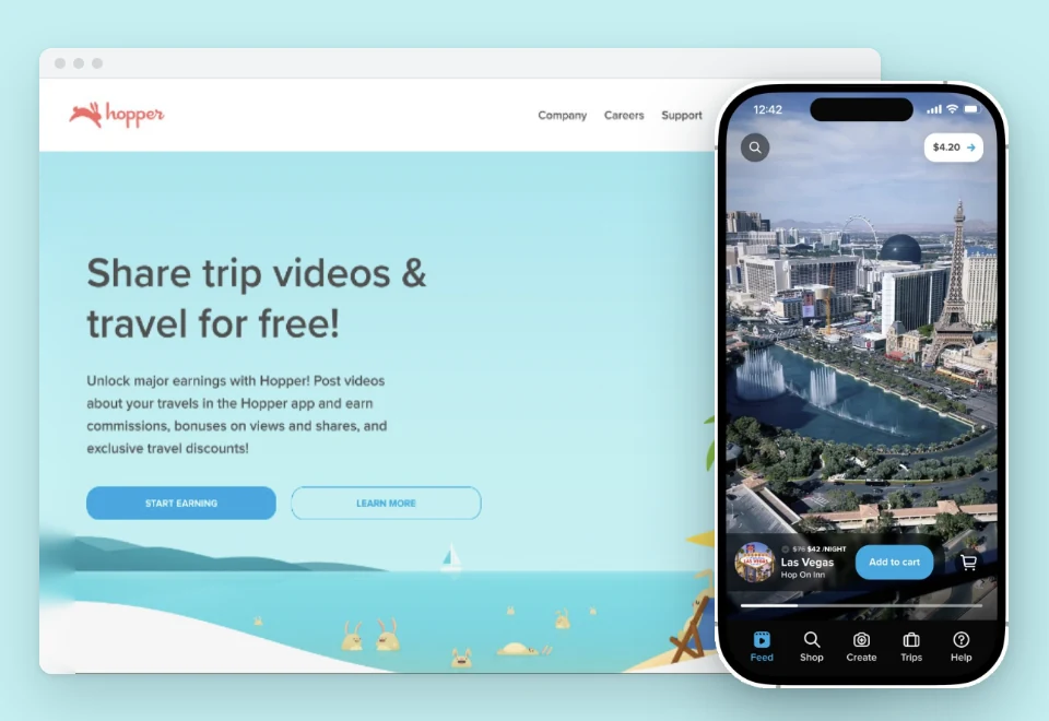
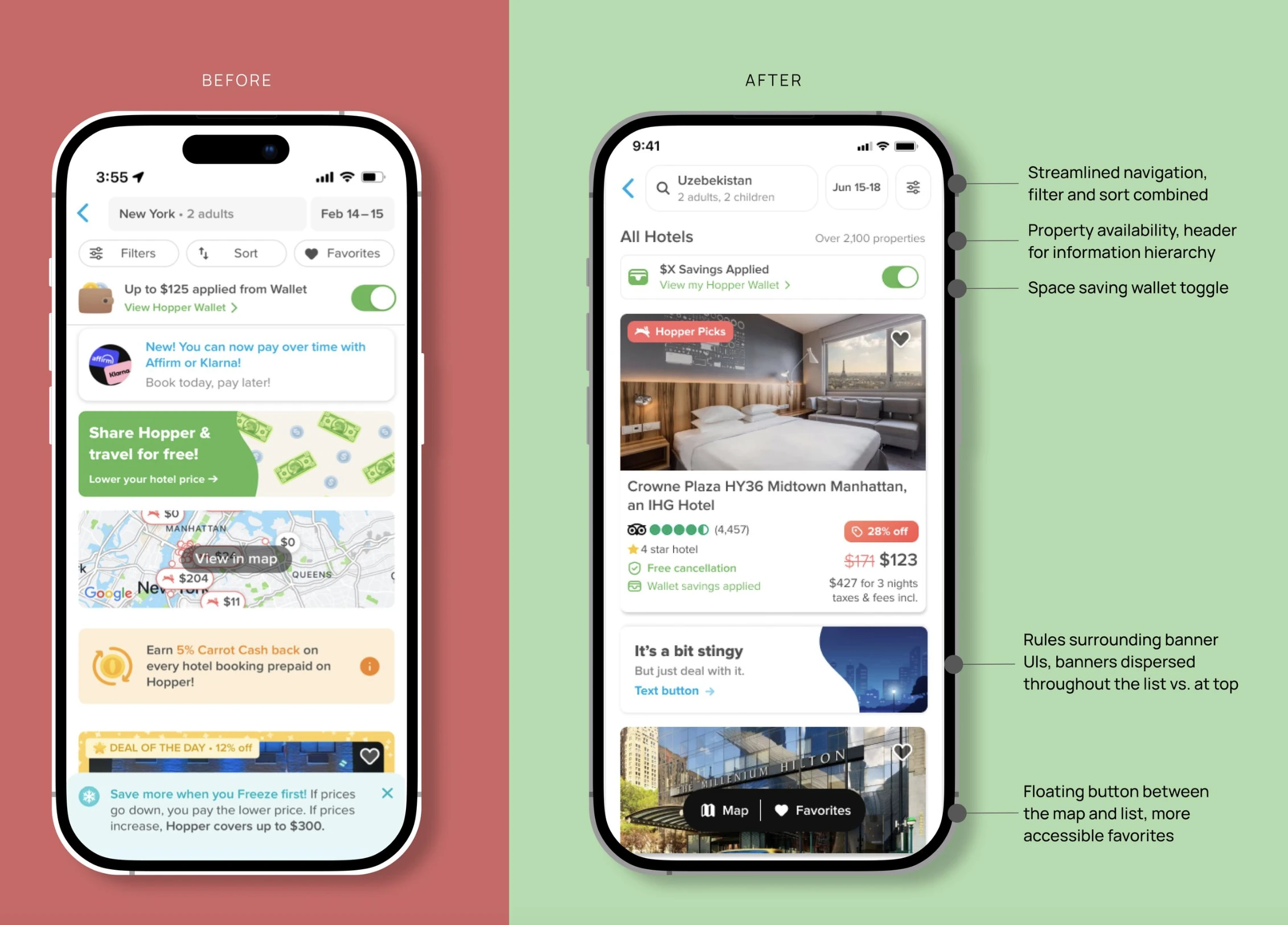
Hopper’s hotel list was cluttered with banners and pop-ups that buried the actual listings. I simplified and standardized the list so shoppers could see hotels first and trust what they were seeing.
Results

The challenge
Nearly 35% of shoppers never saw a single listing, which led to a 65% drop-off in bookings. In interviews, users described the app as cluttered and hard to trust.
The solution
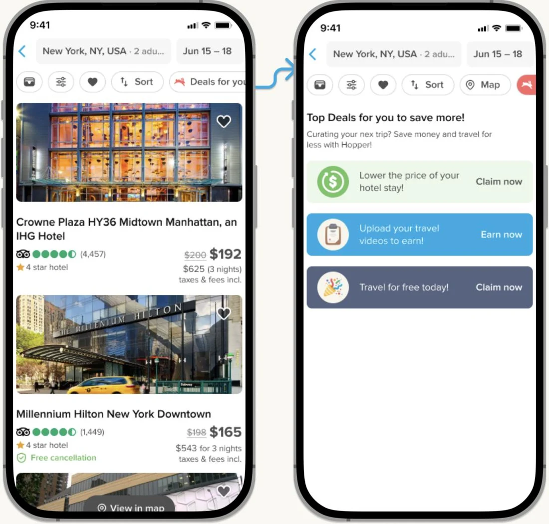
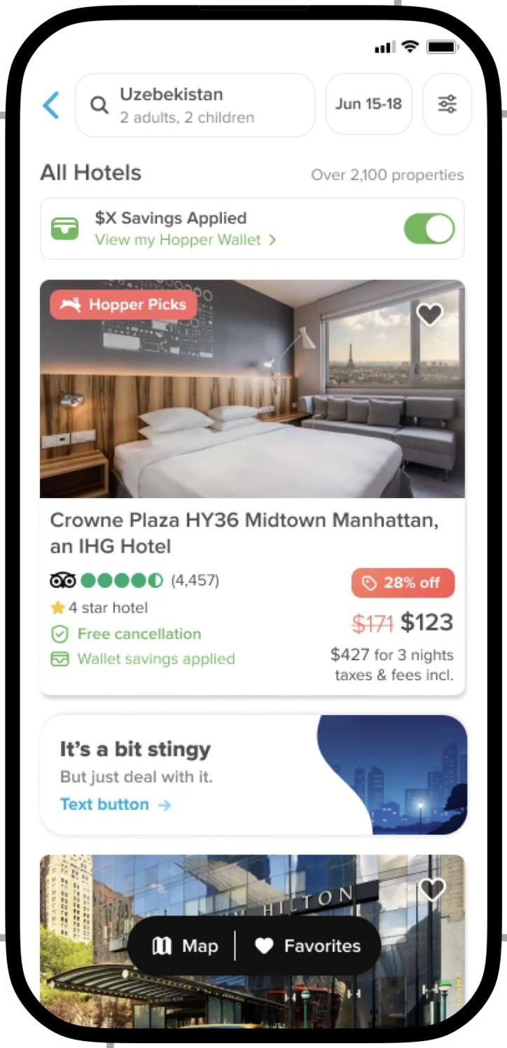
I cleared out the top of the list, created rules for banners, and moved the map to a floating button, so the first thing shoppers see when they scroll is hotels.

Process
Here’s how I went from research to the banner system we shipped.
1 / 3
I started with past data and a competitive analysis to form my hypotheses, then validated them in 20+ interviews.

2 / 3
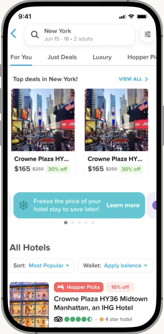
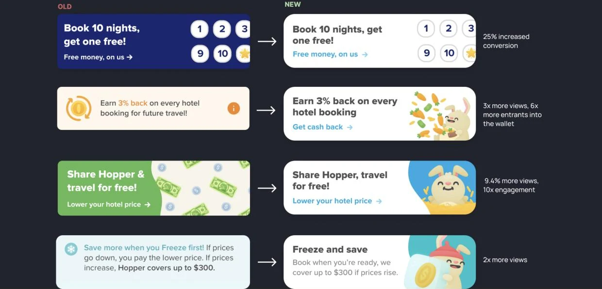
Users wanted the banners gone, but 40% of app revenue came from what they advertised. I explored four ways to keep banners without getting in the way of shopping.


3 / 3
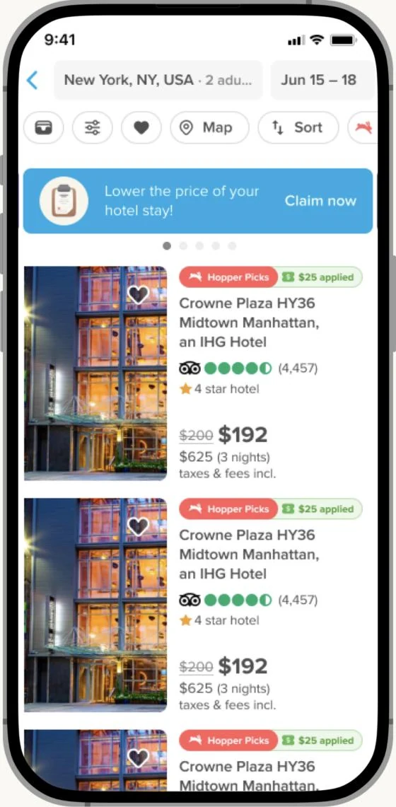
I created a banner style guide with fixed sizes, one image and one call to action, and placed banners between listings. This led to higher conversion and higher intent from shoppers who tapped on them.

Final design
More case studies
All work →